Brand Identity and Visual Systems


Brand Identity and Visual Systems
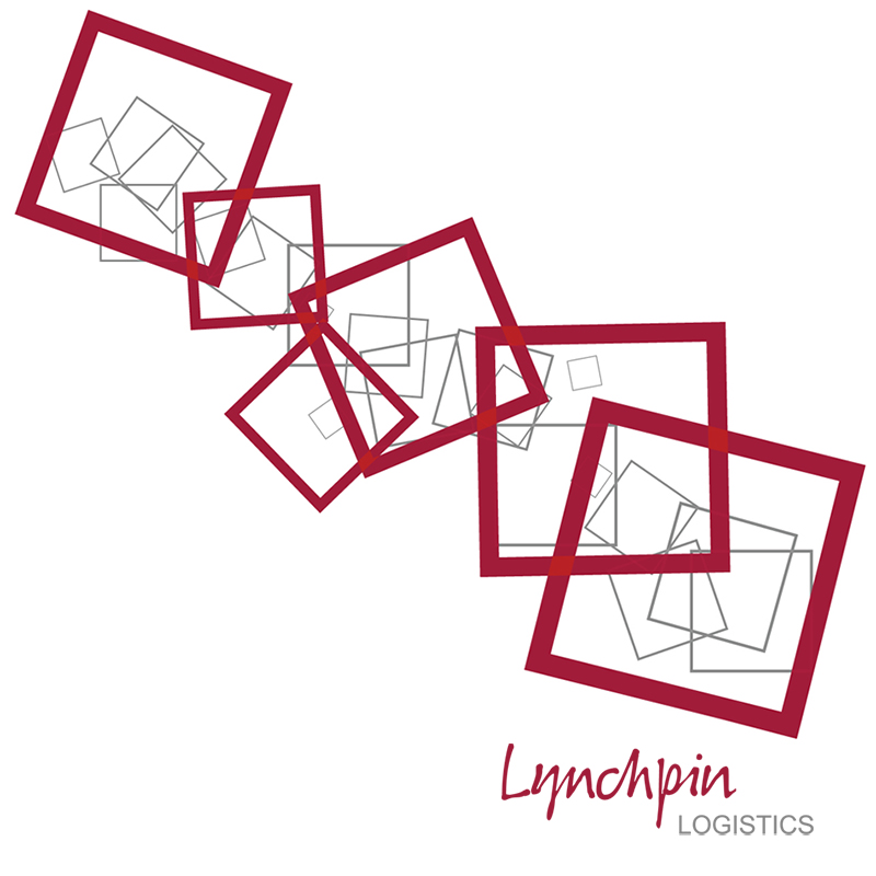
Lynchpin Logistics, a provider of storage, order fulfilment, and distribution services, sought to develop a new brand identity that clearly differentiated the business from its competitors. The objective was to move away from the traditionally masculine, industrial aesthetic common within the logistics sector, avoiding predictable warehouse imagery, and introduce a fresh, modern visual language with a warmer, more approachable feel.
I was engaged to create the new look and feel for the business, with full creative ownership of the design direction. The only constraints were to retain the existing logo and incorporate the established brand colours of red and grey.
Reframing the warehouse environment, I stripped away the cold, heavy visual cues of cement and steel and reintroduced them in a softened, abstracted form. Clean white and rich black backgrounds became the foundation of the brand, complemented by subtle references to concrete textures — most notably within the website design. A system of energetic, overlapping ‘tumbling boxes graphics in red, white, and grey was developed to add movement and visual interest, supported by secondary graphic elements and watermark patterns.
The revitalised identity was rolled out across all brand touchpoints, delivering a cohesive and modern brand experience.
Years later the business was sold, and the new owners maintained the logo branding of Lynchpin Logistics, but unfortunately the website lost its unique style to return to the factory imagery and structural stale font style, losing its personality and edge it once had, with it redone to a generic WordPress template.
I am currently updating all imagery of my website so you will soon be able to view the previous design compare to the existing website real soon.
.